

“Informed decision-making comes from a long tradition of guessing and then blaming others for inadequate results.”
– Scott Adams
Which would have been a better bet for you in 2012? Investing in the S&P 500 index or randomly picking one of the members of the index on the first trading day of the year and selling it on the last day?
The results for 2012 were surprisingly close.
Before you keep going, pick a side. At the end of this article, I want you to tell me in the comments what side you picked, and what percentage of stocks you thought would beat the average. We’ll see who came closest. No cheating and no after-reading mulligans!
Ready?
First, I’ll tell you what I thought and my reasoning for why I thought what I did, and then we’ll look at what the numbers actually revealed for 2012.
My general assumptions in any given year are that only about 40% of stocks which comprise the Standard & Poor’s 500 index will outperform the actual S&P 500 average. The reason for this is that you can have stocks which do particularly well pulling up the averages, but a stock can only lose 100% of its value. Granted, the S&P 500 is a value-weighted index, meaning that Apple will have more weight in the index composition than, say, Gilead Pharmaceuticals, so if you had a bunch of the smaller cap stocks performing really well, they might not compensate for one of the giants taking a mighty tumble.
Furthermore, past research shows that, through 2008, 64% of stocks underperformed the Russell 3000 index in their lifetimes. There is some survivorship bias in comparing extant S&P 500 stocks versus lifetime performance in the Russell 3000 index, which is why I skewed the numbers slightly higher.
How close was I?
The Performance of the S&P 500 Stock Components by the Numbers
In 2012, the S&P 500 index was up 11.7%.
To compare the performance of the components, I took the 495 stocks which remained in the index throughout all of 2012, eliminating either new entrants or spinoffs. I then looked at the opening prices on January 3, 2012 and the closing prices on December 31, 2012 to see how well each stock performed over the past year. If the performance was better than the 11.7% average, then it was a winner. If not, it was a loser.
But first, I also looked at the number of negatively performing stocks (e.g. those which were down on the year) compared to the number of positively performing stocks. If all you care about is return of capital rather than return on capital, then this number is for you. I hope nobody falls into that category if they’re investing in equities, by the way. Of the 495 stocks which were in the S&P 500 index from the beginning of January through the end of December 2012, 373 of them, or 75.4%, ended the year up and 122, or 24.6%, were down on the year.
In total, 227 stocks outperformed the average, or 45.86% of the components exceeded the 11.7% gain in 2012.
If you picked a winning stock, you had a pretty decent chance of picking one that did REALLY well.
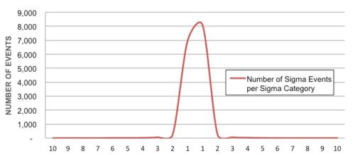
Distribution of performance of individual stocks of S&P 500 in 2012
This chart shows the distribution of stocks that fell within performance bands. 18 stocks has losses of 23.4% or worse, while 145 stocks had gains between 0% and 11.7%. 62 stocks gained more than 35% in 2012.
Let’s look at the David Letterman Top 10 and the Bob Uecker Bottom 10 stocks for 2012.
| Ticker | % Change |
| PHM | 180.7% |
| S | 137.2% |
| WHR | 110.5% |
| EXPE | 106.5% |
| BAC | 101.9% |
| LEN | 92.7% |
| TSO | 83.6% |
| MPC | 82.3% |
| STX | 81.1% |
| GILD | 77.1% |
The Top 10
| Ticker | % Change |
| APOL | -61.6% |
| AMD | -56.6% |
| BBY | -50.0% |
| HPQ | -45.9% |
| JCP | -45.2% |
| PBI | -43.7% |
| CLF | -40.2% |
| ATI | -39.0% |
| TYC | -38.4% |
| DELL | -32.3% |
The Bottom 10
I admit, I was surprised by these findings. I expected a coin flip to be a clear winner, not a 54-46 winner. There were presidential elections which weren’t as close as this.
Still, even in what was a good year for individual stocks as compared to their indices, you STILL would have been better just sticking with the index. In fact, if the performance of the stocks mirrored 2012, you’d only need 6 years of choosing stocks with a dart before you had a less than 1% chance of beating the market.
Those aren’t the types of odds which I want to play with. Add that in with fund managers who charge load fees or assets under management fees, and you’re playing with fire with your investments – namely, the fire that will burn your money and leave you with nothing but ashes and tears.
How close were you in your guess? Does this information make you feel better about picking individual stocks, or does it make you think again? Tell us about it in the comments below!
Author Profile
- John Davis is a nationally recognized expert on credit reporting, credit scoring, and identity theft. He has written four books about his expertise in the field and has been featured extensively in numerous media outlets such as The Wall Street Journal, The Washington Post, CNN, CBS News, CNBC, Fox Business, and many more. With over 20 years of experience helping consumers understand their credit and identity protection rights, John is passionate about empowering people to take control of their finances. He works with financial institutions to develop consumer-friendly policies that promote financial literacy and responsible borrowing habits.
Latest entries
 BlogJuly 8, 2024How to Fast-Track Approval for Section 8 Vouchers
 BlogJuly 8, 2024Unlock Apple Business Credit with No Credit Check Needed
 BlogJuly 8, 2024A $18 Million Per Year Investment Plan for Democrats to Control the Texas House
 Low Income GrantsSeptember 25, 2023How to Get a Free Government Phone: A Step-by-Step Guide